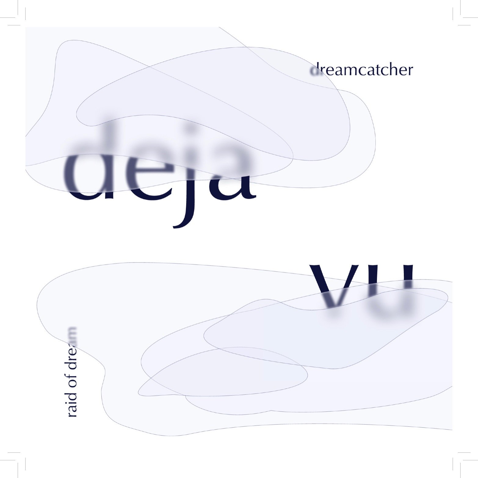
Deja Vu Music Booklet
My Role: Art Direction, Visual Design
Project Duration: A five week long school project for a Graphic Design Fundamentals Publishing course completed in April 2022
Tools: Adobe InDesign, Figma, Photoshop
This project aims to visualize Dreamcatcher’s song, titled Deja Vu, into a melancholic piece to express the feeling of recalling a reality that one has felt they’ve seen before. The concept revolves around the idea of reminiscing and, as a reference to the song’s music video, “reliving a past experience.” My design approach included the use of repetition and the Gestalt principle of closure to represent the feeling of visions/memories echoing in one’s head. In addition, as the song has many soft, ballad-like parts, I aimed to keep a delicate and airy feeling to the piece using opacity.
The targeted audience for this booklet is Dreamcatcher’s fanbase, known as InSomnia’s.
Concept
I chose to conceptualize the concept of deja vu and its sensation of feeling as if one has already experienced an event before through obscuring the text with both opacity and blur. I especially wanted to play with the feeling of familiarity while still not fully recalling everything that comes with deja vu. I chose to invoke this through the type being blurred and covered as it creates a sense of familiarity when reading the type as the Gestalt principle of closure is used so that the text is still readable. I also focused on maintaining the delicate and airy feeling to Dreamcatcher’s Deja Vu through using light values such as greys and pale purples in the colour palette. I also chose a clean and elegant serif typeface, Classico URW, to match the serious tone of the song while also nodding to their fantasy inspired music video.
On the left, cover ideation sketches that highlight visualizing the concept of deja vu through repetition and through blurring. On the middle and right, cover mockups that highlight visualizing the concept of deja vu through repetition and through blurring to play with readability
For the cover, I especially wanted to play with the feeling of familiarity while still not fully recalling everything. I blurred and covered the type while using the Gestalt principle of closure so that the text is still readable. Throughout the entire booklet, I wanted to focus on maintaining the delicate and airy feeling of the ballad-like parts in Dreamcatcher’s Deja Vu through using significant amounts of white space and a thinner typeface and weight for the body copy alongside the use of lighter values such as greys (and pale purples in the cover). The contrast of the heavier bold weight and larger size of the headers to the thinner and smaller sized body copy was done to represent the contrasting parts of Deja Vu that switch from a softer ballad to a more heavy rock.
Infographic Design
I chose to represent the timeline of events in the music video using an elliptical pathway that is broken off. This was to represent how the events shown within the music video are done through a series of flashbacks and how one of the members of Dreamcatcher, Yoohyeon, goes through deja vu. Specifically, as seen in the music video, she has distorted memories regarding the events that have happened in the past. Due to this, I wanted to break off the pathway to show that it does not connect all back together properly for Yoohyeon. In addition, for the sake of readability, I chose not to use the blurred shapes from my cover. Through this, those shapes can then be exclusive to the cover which makes it more unique for the overall music booklet.
Infographic mockups; the one on the very left showed me that using the blurring shapes looked messy and didn’t work for the infographic or interior pages. I instead experimented with different versions of representing a timeline and maintained a more minimalistic design.
My overall goal with this project was to learn more about the publishing process and create a unique concept based around the song and its themes. I was fairly successful with these goals as I felt I was able to execute the concept well, especially for the cover. Looking back, I’d bring more of the elements of the cover into the interiors to really push the concept further.
The final booklet can be viewed below.


