ModaHan Magazine
My Role: Art Direction, Brand Conception and Design, Visual Design
Project Duration: A thirteen week long school project for a Graphic Design in Transition: Print and Digital Periodicals Publishing course completed in April 2024
Tools: Adobe InDesign, Adobe Lightroom,
This project involved envisioning and designing a single publication of my choice to create a memorable and appropriate brand.
ModaHan is a North American magazine that bridges tradition and modern fashion. We embrace young East Asian adults and inspire them to connect back into their culture and implement their traditional wear in their everyday life. ModaHan acts as a gateway to introduce the history and traditional garments through light educational articles, how-to articles, and shopping guides. With stunning photos and personal narratives, ModaHan captures the intricate and unique characteristics of the revival of traditional wear.
Representative of connecting East Asian traditional clothing with modern fashion, ModaHan is a play on the words “modern” and “Han.” Han comes from three periods of time in East Asia — the Han Dynasty in China, DaeHan Jeguk ("Great Han Empire") in Korea, and the Han System in Japan. The play of words personifies the medley of new and traditional.
Deliverables for this project included the magazine cover, table of contents, editorial feature, and a subscription campaign. In addition, a mockup of the editorial feature on the magazine’s website was also designed.
Cover
The cover design prioritizes the magazine name for immediate attention, employing The Seasons typeface for its depth in letterforms and evocative nod to East-Asian calligraphy, with a modern, classy twist. Brightening and enhancing the model while darkening the background draws focus to her silhouette, providing a clean canvas for text placement and guiding audience attention with her gaze. Strategic use of cover lines for just the features ensures content relevance, enticing the audience to delve into the magazine's offerings, ultimately driving purchase intent.
Editorial Feature
In my editorial feature, I aimed for a contemporary, sophisticated vibe, blending stunning photos with educational content to inspire readers aged 20-30. I avoided text heavy pages to keep engagement high, connecting pages with a red line for flow. Using rounded shapes like circles and arcs in images added uniqueness. The web version maintained this feel with ample white space, emphasizing a clean and classy aesthetic. The lead-in photo featured a distinctive rounded shape for immediate viewer interest. Full-width photos were then used to enhance engagement.
Subscription Campaign
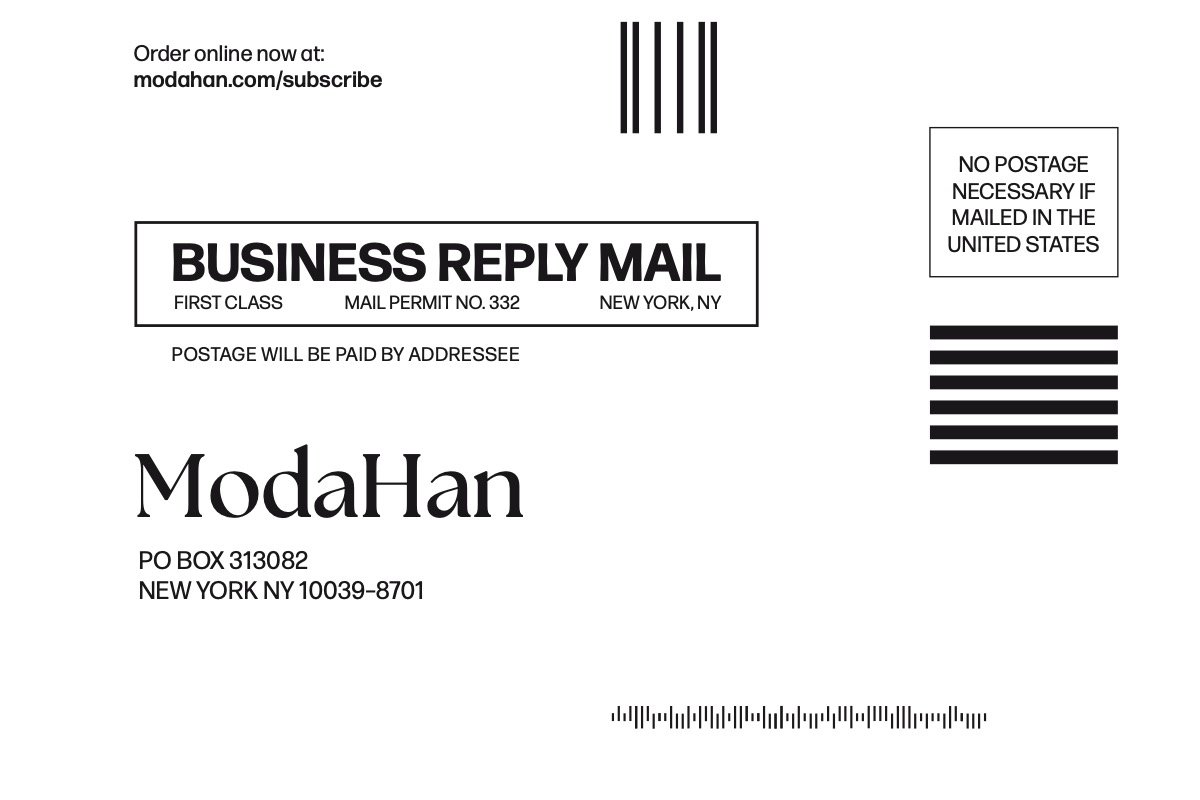
The subscription campaign prioritizes clear call-to-action. Blow-in ads focus on functionality and features the subscription offer prominently in red, using a half circle for consistency with the rest of the magazine. This provides a clear placement for the logo and magazine covers. The web ads maintain simplicity, highlighting the offer with a bold and contrasted red half circle and white text, supported by a descriptive subheading and visuals of the cover to entice potential readers.
Reflection
My overall goal with this project was to push myself outside of my comfort zone to further expand on my branding and design skills. I challenged myself to experiment with different shapes for the magazine, leading to rounded shapes like the half circle and pills. I was successful with these goals as I was able to execute the concept well in all the different deliverables.
The magazine, website mockup, and subscription campaign can be viewed below.


